Sunday April 19th: The straight and narrow on the inside track
How many clichés can I cram into one title? Last week, I left off with an account of the closest thing to an epiphany that might happen around here: my idea of imaging roots growing inside the agar because, cliché aside, they really do grow straight, with almost mathematical precision. Before picking up the thread (there’s another!), by way of full disclosure, I should recount that last week I did a segment-growth experiment with sunflower, which was satisfactory though short of brilliant, and I planted cucumber and pea for life-in-the dark this week. Last but definitely not least, the CPIB crew raised their voices and sang for me a rousing chorus of Happy Birthday to You. One doesn’t need to be child to enjoy being at the focus of birthday cheer (especially without having to extinguish 58 candles on one breath). Or maybe I am a child? All the same, I felt a glow.
All right then. At the end of last week’s post, I showed a plot of the root’s velocity profile every five minutes for 90 min. If you are just tuning in and are looking dolefully at the words velocity profile, please read the first part of last week’s post. This was for a root whose collie-like sallying over the agar surface had been trammeled by having it grow inside the medium. All the velocity profiles have about the same shape and they all overlap. That is what I mean by saying the profile is stable over time.
But the curves are not perfectly overlapped. Is there a pattern? Or to put it another way, is the blur of curves caused by good old biological variability? The random clang and bang of Brownian motion (which I discussed here)? How can I tell?
To search for inner patterns, I first made an average velocity profile (took the average of each velocity value at each x-axis position) and then subtracted that profile from each one, and plotted those differences. That is, I plotted the difference between each velocity profile and the grand average. I did this because it struck me that if there was an orderly progress of the profiles then there would be some kind of coherent movement towards and away from the mean. What I got is this:
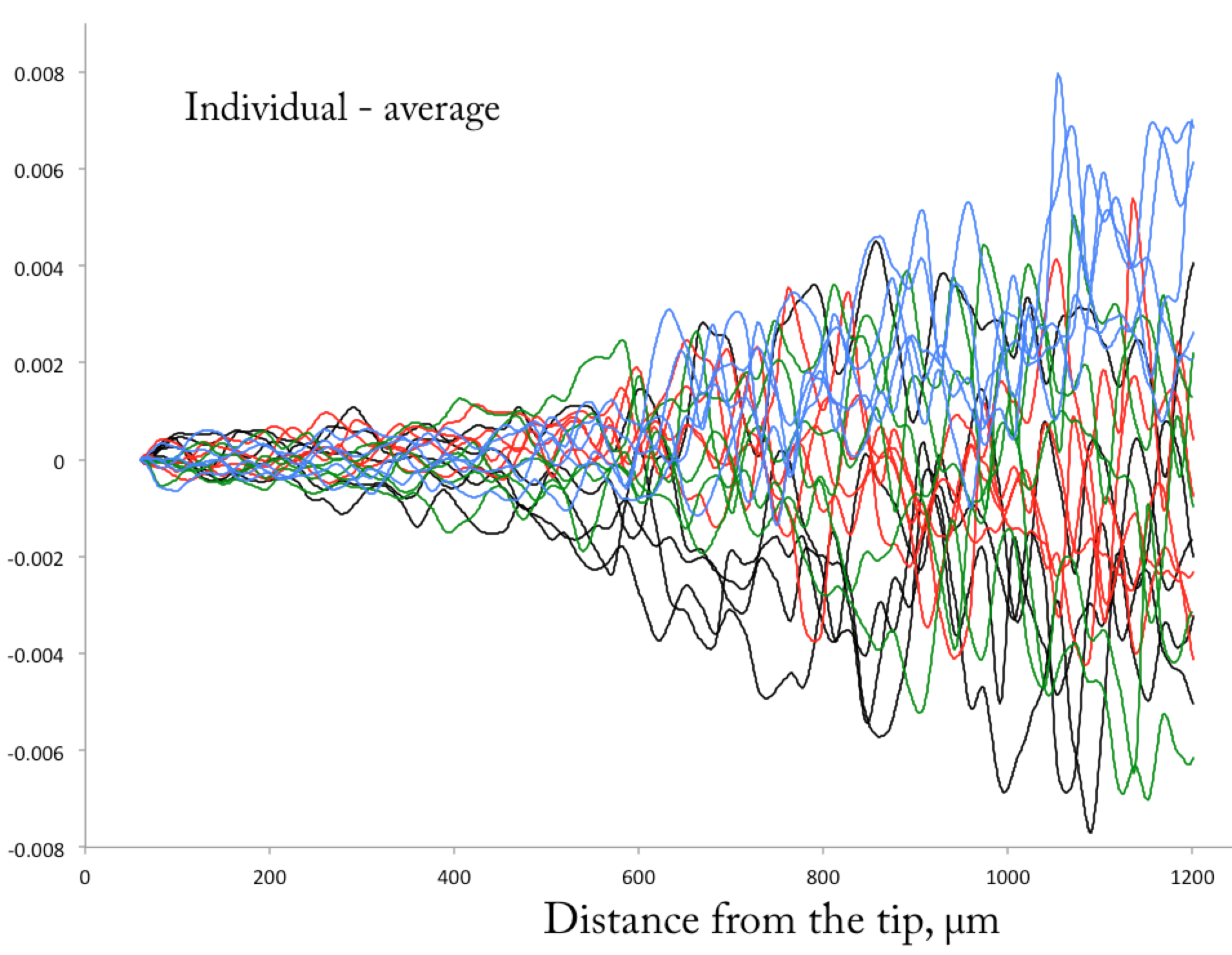
So-called “delta” plot, showing the difference between each line and the average of all twenty lines. The units of the y-axis are in microns/sec. The order of the data is coded with the first five times black, the next five red, the next five green, and the last five blue.
I will refer to this plot as the delta plot because delta is Geek (and maybe Greek too?) for difference. OK, at first the delta plot looks like the squiggles of an artist trying to draw sunlight on a turbulent lake. But look longer and a few things emerge. To understand the graph, remember that as in the actual velocity profile plot from last week’s post, I coded the lines so that the first five time points are black, the next five are red, the next five are green, and the last five are blue. Starting about 500 microns from the tip, the deltas get bigger. This is not surprising—the expansion rate in the meristem (region on the left) is about one fifth to one tenth of that in the elongation zone (the region on the right). But note the y-axis numbers are ± 0.006. Being a screen shot from my notebook, I neglected to put units on the y-axis; the units are the same as the velocity plot, microns/sec. So the full scale here is in fact ± 6 nanometers per sec. This is nano science!
What is of interest here, though, rather than the size of the noise, is the presence of any temporal pattern. For that, the welter of lines and squiggles makes it hard to say, though I can see a kind of preference for blue lines in the upper part of the right hand side of the graph. I sought to do better than this inkblot-esque blot.
To explain what I did, I’ll start by showing the graph of the average velocity I made to calculate the deltas in the first place.
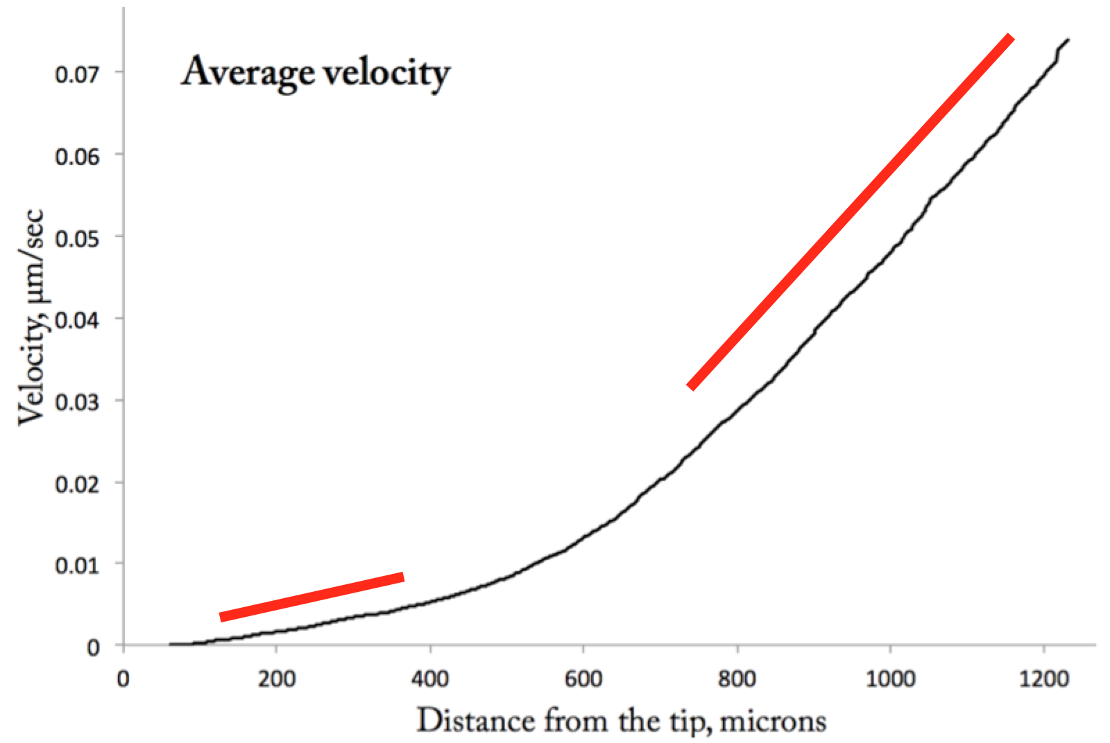
Average velocity verus distance. This is the average of the twenty single time profiles shown in the April 12th velocity profile. The fat red lines indicate regions that are essentially linear.
You can see that the plot has two regions where velocity increases more or less linearly with position. I marked them with fat red lines. The first one is in the meristem and the second one is in the elongation zone. I started with the elongation zone. For each time point (not the average), I fitted a line to the data safely within the linear region (e.g., between about 800 to 1100 µm). Then I calculated the x-axis point where velocity was equal to 0.05 µm/sec. I chose that value because it is about in the middle of the region used to fit the lines. Here is the plot:
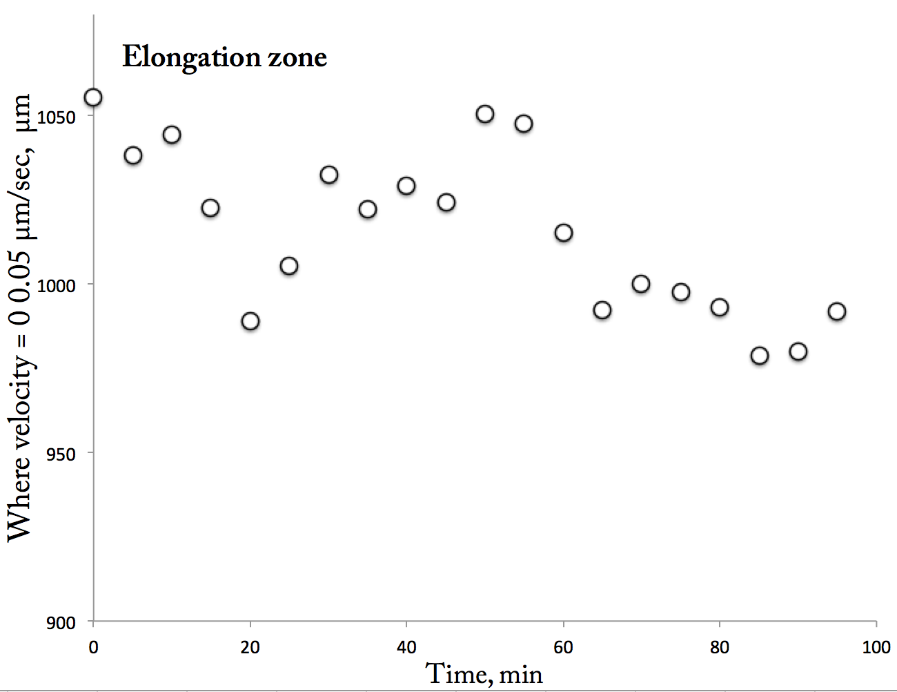
The Pattern Plot. A plot of the position where velocity = 0.05 micron/sec vs time. Each of the twenty velocity profiles gives rise to a point on the plot. The position was calculated by fitting a line to the data within the elongation zone and then finding the x-value on that line where v = 0.05 microns/sec.
This is a kind of tricky plot. You are looking at what happens to the position (i.e., distance from the tip) where the velocity profile reached a set value as a function of time. If nothing were happening to this profile over time, then that position might bounce around but the overall plot should look flat: no net change in position with time. In contrast, here, it looks like there is a trend: that velocity seems to be being reached closer and closer to the tip. That position starts out around 1050 µm from the tip and 90 min later at the end of the run is around 990 µm from the tip, a net displacement of around 60 µm. This at least explains the patch of blue evident in the delta plot because the last five data points (the blue data) are all at positions close to the tip.
Is this convincing? I am not sure. What it purports to show is that the position where the rapid elemental elongation process ramps-up moves predictably within the root’s growth zone. To check for flaws, first, I plotted elemental elongation rate over time for the elongation zone; that is, the slope of those lines. These slopes had no trend over time, a helpful stability because it uncouples the rate of elemental elongation from the position parameter. It means that it is reasonable to treat the data within the elongation zone as a series of parallel lines.
As another test, I made the same kind of magic position vs time plot, but in this case for the meristem. In contrast to the elongation zone, I could think of no reason why that position should move over time, other than changing elemental elongation rates or systematic error. Happily, there was no trend for the position in the meristem for the magic velocity position to change. It seemed random, as did the changes over time in the rate of elemental elongation in the meristem.
Well, this particular dataset has a pattern. Woot! I am pleased to see it because it beats having noise. But as anyone knows who has flipped a coin more then once, patterns can emerge from random events. To tell whether the events are underlain by anything more than noise, we require repetitions. If you get six heads in a row, twice, you can bet on having a bent coin. It is time to flip the coin more times, to image more roots inside the agar.
And last week I did just that. This time, I imaged for three hours. And here are the data:
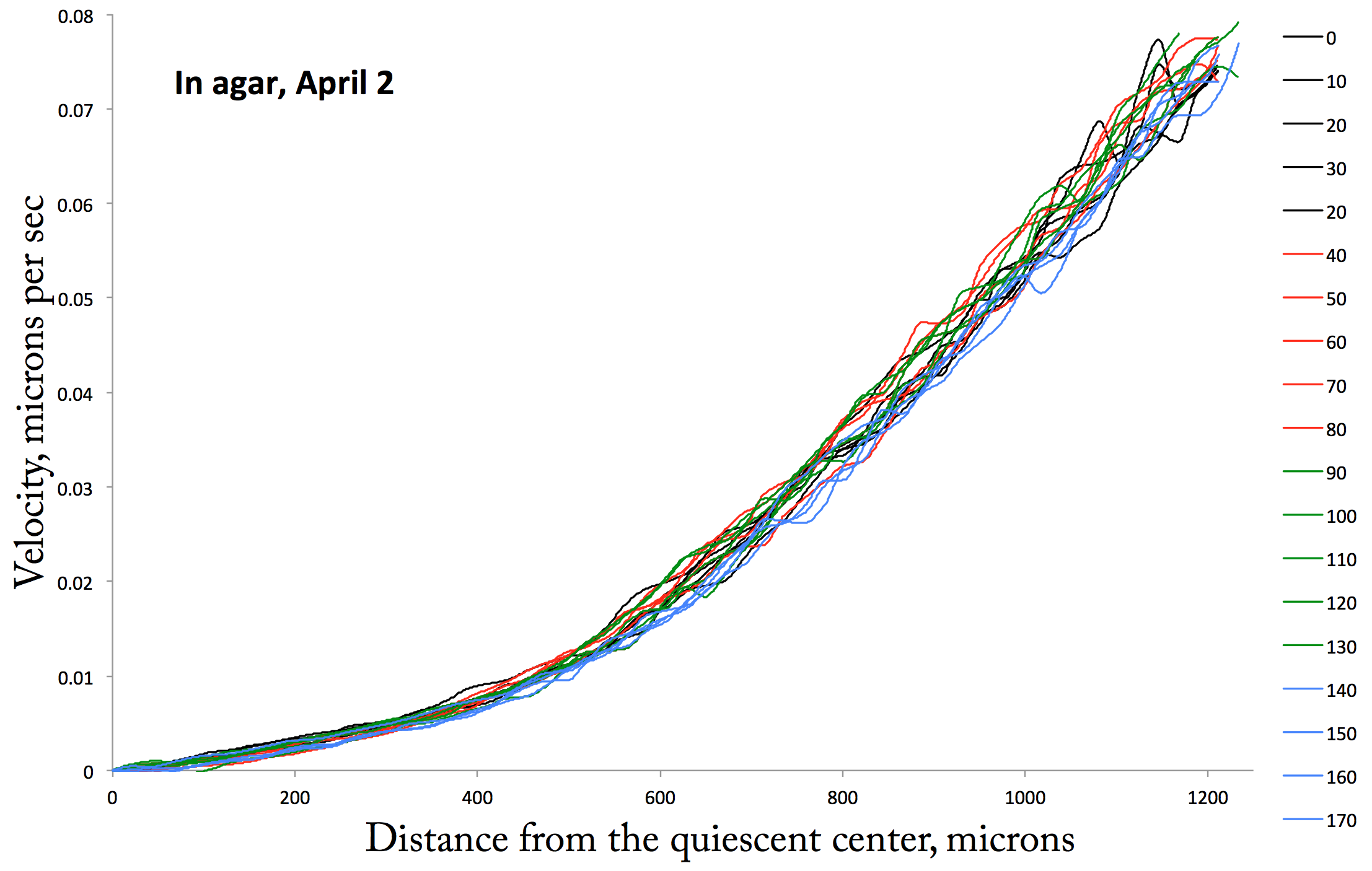
The New Data plot. Velocity versus positon for a root imaged on April 15th. Each profile is separated from the next by 10 min, as indicated in the legend.
Again this is coded in groups of five time points per color, as shown in the legend. The stability of this profile is obvious. Although it is only a second example, roots in agar are the way to go as a system for studying the stability of the velocity profile. Score “1” for epiphany (in this metaphor, who is losing?). But do I see the green curves huddling on one side and the blue curves on the other (in the elongation zone)? Mmmmaybe. I last week, I obtained this raw data and did the analysis this far. I didn’t have time for the remaining steps. Something to look forward to for next week. Til then…