May 24th Rhythms and blues
In which plots thicken -- or at least mulitply -- there are three of them. Rhythms in root growth and stablity therein vie for our favors.
This week, I spent Monday and Tuesday in the lab. On Wednesday, I visited the University of Sheffield of seminar and on Thursday and Friday, Laura and I went to Warwick for some touristication. Now my musings in these pages are most definitely not supposed to be travel bloggery but I would be remiss to fail to plug the Lord Leycester Hospital. Here is a clutch of medieval buildings and a garden, all in excellent shape, that you walk around and through. If you are in that area, go have a look.
With a mere two days in labu, this post will be short (Yay!). I spent time on the Tuesday making slides for my talk and planting some maize for a segment experiment. On the Monday, I analyzed root growth. Readers of the April 19th and May 5th posts will recall that in my efforts to plumb the stability of the root’s velocity profile, I found a rhythm. The position where elemental elongation rate accelerates seems to move closer and father from the tip with a period of a few hours. I had seen this in two roots, the first one imaged over 90 min and the second over 180 min. I now have a third root, also imaged for 180 min, and again that rhythm shows up.
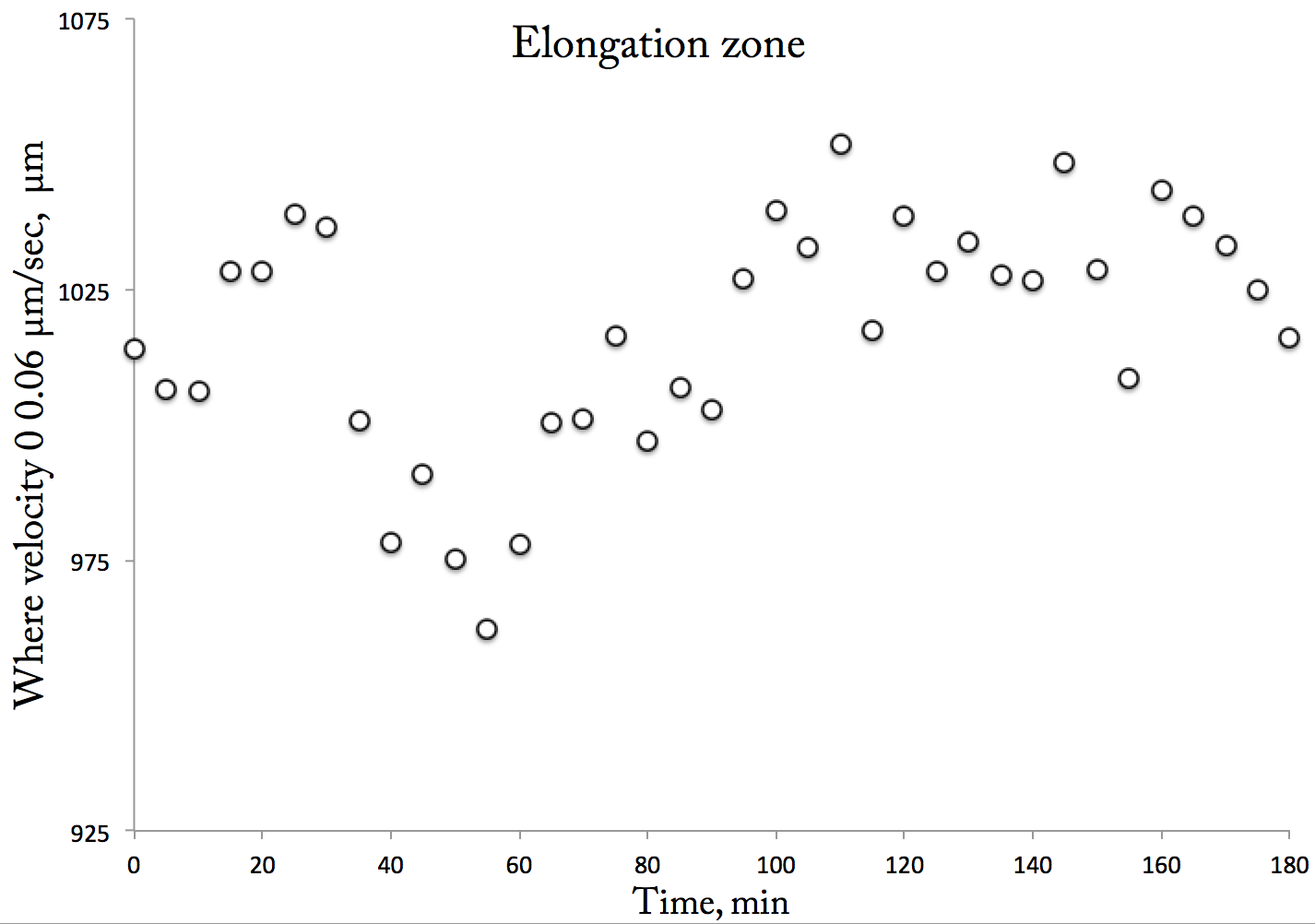
A plot of the position where velocity reaches 0.06 microns per sec as a function of time for ‘root 2’. The position was found from a linear regression line fitted to the velocity vs position data for each timepoint between 800 and 1200 microns from the tip.
This is not as regular as the second one (May 5th) but neither is it all noise. Is it real? I still don’t know but having seen it in three (out of three) roots, I am growing fonder of the idea. To be sure, the rhythm appears following an analysis that is, in a word, crude. The good news is that I had a good long talk with a mathematician, Simon Preston, who is interested in data fluctuations, and he is working on analyses that are refined, or at least defensible. My job in the meantime is to increase the sample size, all bow to the mighty n.
Nevertheless, in a move that is strictly fair game, I averaged all the velocity profiles for the third root. There are 37 of them (every 5 min from zero to 180 min). The average looks nice and smooth, as one would expect:
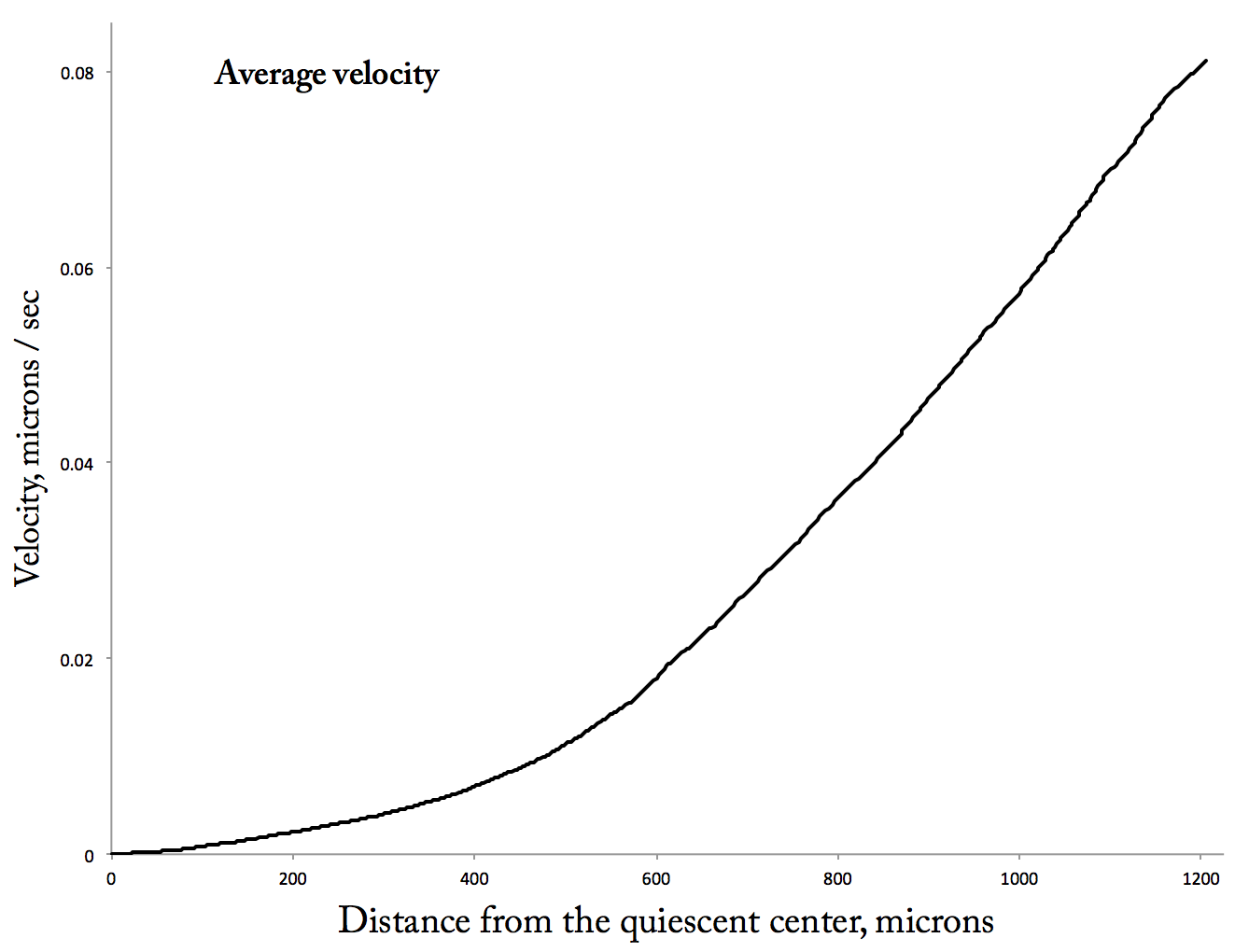
Average velocity vs distance for the individual timepoints of “the second root”.
OK fine. But ahh, now, here is a plot of the standard deviation at each point (there are data every micron so these plots are shown as lines, not symbols):
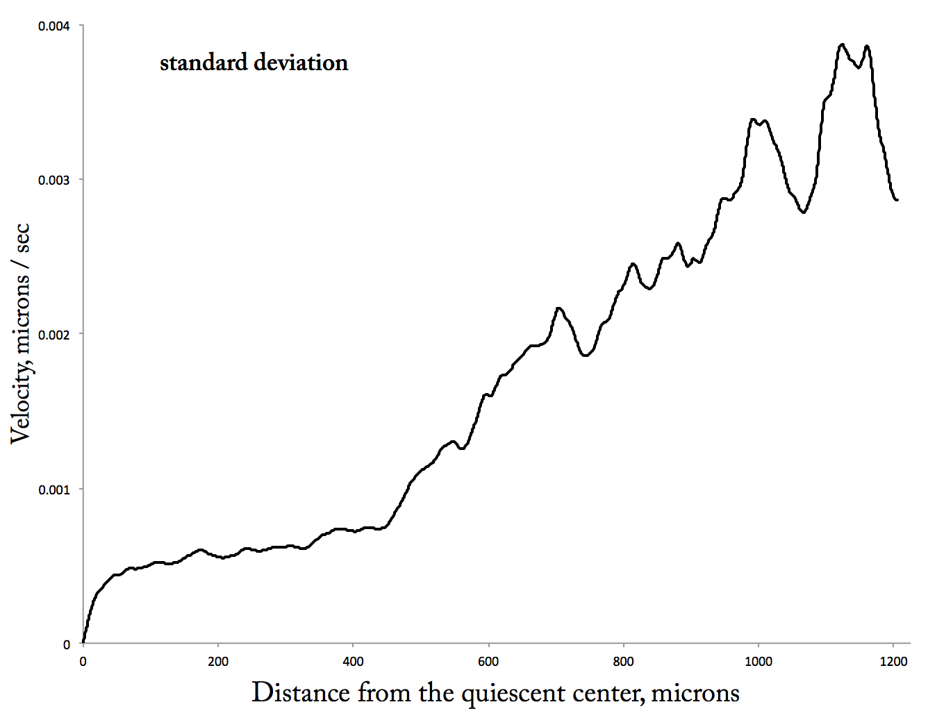
A plot of standard deviation versus distance for the timepoints used in “root 2”. Of course, it is conventional to plot standard deviation as a bar around the average (the averages are plotted just above). But here the standard deviation is plotted directly so that its magnitude can be readily apprehended.
This plot somewhat resembles the velocity plot, indeed, standard deviations commonly scale as does the mean around which they vary. What strikes me as unusual, really unusual, is the sharp transition around 440 microns from the tip. Remember, 37 individual curves are being averaged, and there is nothing fishy going on, just the good old standard deviation. I think the presence of an abrupt transition in the standard deviation plot underscores the stability of the velocity profile. At around 440 microns from the tip, the data become more variable, and this position is similar across all the individual time points. Again, it will be essential to see whether this pattern is reproducible in other roots.
Now, is the stability inferred from this in conflict with the rhythm seen from the regression? This is the blues of the post’s title. I don’t think so. One could re-order the curves so that the rhythm was gone but it would not change the standard deviation plot. But were the rhythm to be larger, sweeping in and out by 100 or 200 microns, then that would surely tend to smooth out that transition, so perhaps there is a way to relate these two signals after all? But alas this quickly escapes my intuition. Perhaps, Simon can help express the intersection of these approaches in some meaningful way? Stay tuned for fun with math!